by Elsa Jensen | Mar 18, 2015 | Blog-category, Designs
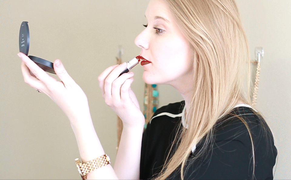
I don’t think I will ever get sick of cinemagraphs. They are so captivating and tell a story in a different way that leaves me wanting to make and see more and more cinemagraphs. So naturally, I had to make one again. While I’ve spent time looking at other cinemagraphs, especially the beautiful ones from the most talented and professional Jamie Beck and Kevin Burg from Ann Street Studio, who began the sensation of cinemagraphs are the experts, if I do say so myself (really though, I could watch their cinemagraphs for hours), I’ve noticed that the key to a truly captivating cinemagraph is the selective movement. Their fashion and beauty cinemagraphs have always inspired me and I decided to give a try at one. I wanted to make a selective portion of movement, so I decided to only show the movement of her hand putting the lipstick on. Making cinemagraphs always teaches me new things and I want to continue to make more in the future and refine my skills in...
by Elsa Jensen | Mar 15, 2015 | Blog-category, Designs, Photos, Videos
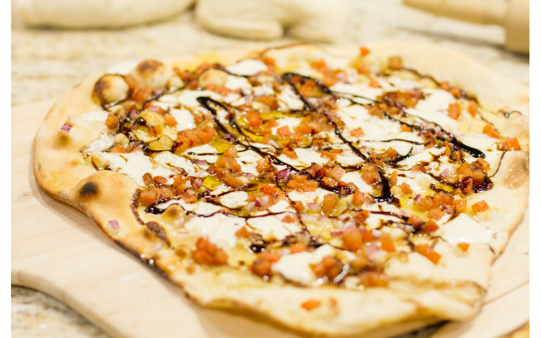
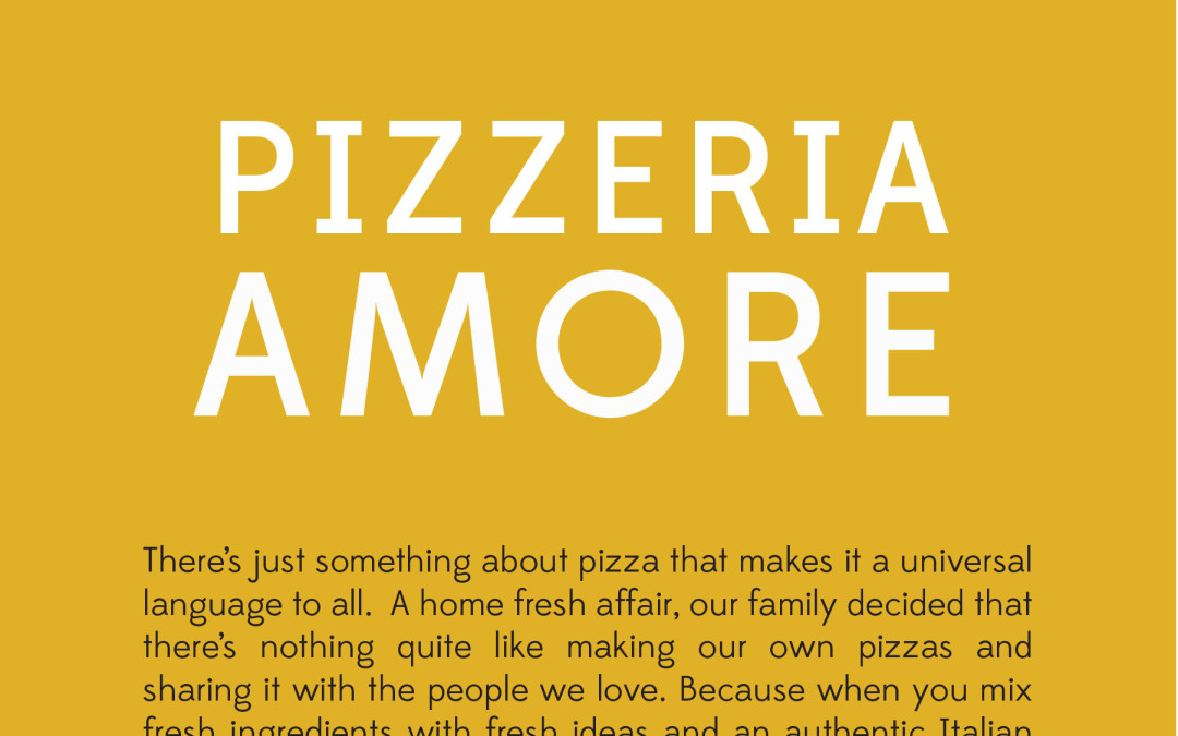
As part of the Communications program at BYU-Idaho, one of our final classes is a senior project. For this class, we pick a project that will showcase everything we have learned while in the communications department and spend 50 hours throughout the semester working on this project and present it to the school at the end during the Senior Showcase. With an emphasis in Visual Communications, I wanted to come up with a project that would showcase all of the things that I have learned and loved while in that department. I’ve shared the story time and again about my family and our pizza tradition. My brothers and I have talked to my dad about starting a pizza delivery business once or twice a week to earn a little extra money and have more fun making pizza. My dad has bugged me time and again about making him a logo or coming up with pizza box ideas for our pizza, but while I’ve always been too busy, I decided that for my senior project, I would finally get to work on this pizza design. I decided that I would start up and create all of the visual and creative aspects that a pizza business would need to begin. With my module set in advertising, it was very helpful for me when I was deciding what it was that I needed to have done for this business and process. I began by branding the company with color schemes, font choices, overall looks, and a logo to be used throughout the branding. I then worked on designing the collateral needs like...

by Elsa Jensen | Mar 14, 2015 | Blog-category, Videos
That’s Amore from Elsa Jensen on Vimeo. Throughout all of this project, I have been the most excited about making this video. I originally made a pizza video when I was very first learning video and have wanted to do one right since then. I think that video has a way of making the viewer feel like they are right there in the video – right there with the people inside of it. And I think that in terms of a business, video can be very powerful in enticing people to want to come to their restaurant, participate in the services, and be a part of what they are seeing. I wanted this video to again, have the feel of our family and what its like to be at our house during this process and feel the connection that pizza has all around. So here is our house, on a pizza...

by Elsa Jensen | Mar 14, 2015 | Blog-category, Designs
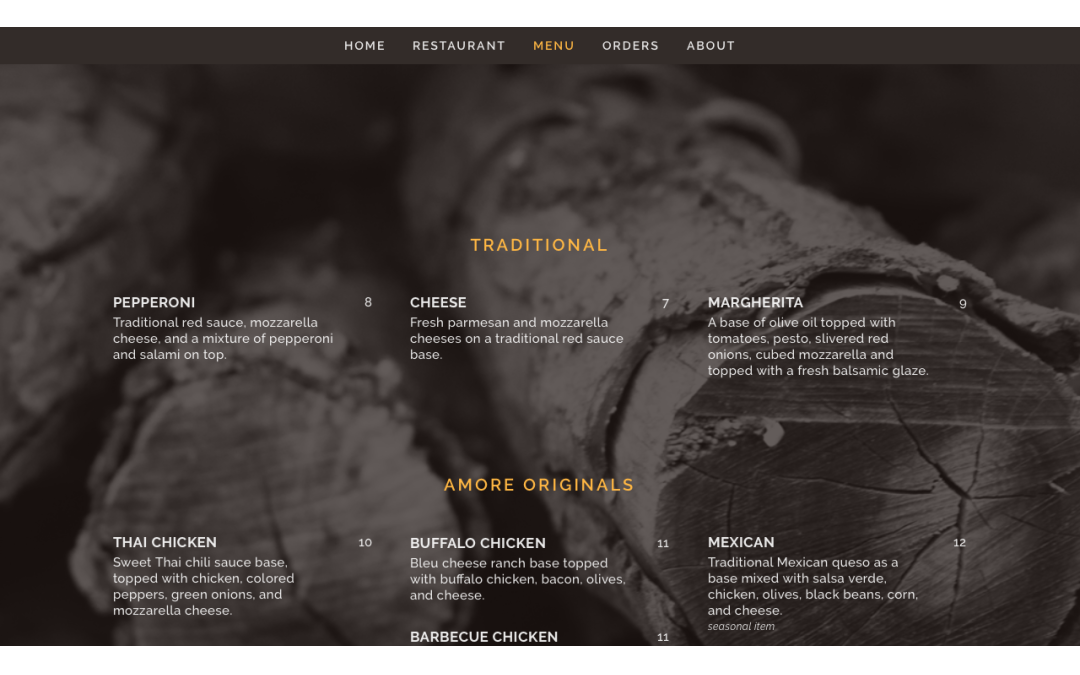
The most intriguing, yet time consuming and difficult aspect of my senior project and I think of most branding and creative projects for a business is building a website. Setting out the priorities of the site, what needs to be added (or not added), creating content, and having it all flow together with a nicely designed visual aspect is part of the entirety that makes for a successful website (no matter how much work it might be). Pizzeria Amore’s website is set up as a one page website – all aspects of the website can be seen without leaving the main page, all you have to do is simply scroll. You can also visit each page by clicking on the link on the menu, but it still stays within the same main interface page. Setting up a restaurant website this way is a good option because of it the access it gives to visitors – in all honesty, most people that visit a restaurant website only visit to see the menu, location, hours, or order form. With this option, most likely, the content surrounding those pages will be visited or more likely to be visited because of the ease and set up of the site. I decided to go with photo backgrounds to incorporate the photography and give the family feel. I kept the color scheme and fonts simple again to reflect the design previously done. Want to take a deeper look at it – well I think you should take a better look at it truly! Follow this link over to the website and see it for yourself!...

by Elsa Jensen | Mar 13, 2015 | Blog-category, Designs
As a small family run restaurant just beginning, there were only a couple of basic design needs, but it was important to make sure they were done with the Pizzeria Amore brand. The basics needs included a menu design and a business card. To stay with the branding and design and showcase a family feel of wood fired fresh pizza, I used the photography from the series with a black and white high contrast look set behind all of the copy and content. To keep the simplicity, I used the same font throughout and simple shapes to add a bit. I also wrote the copy for the front of the menu to share a look into the restaurant before taking a look at the...
