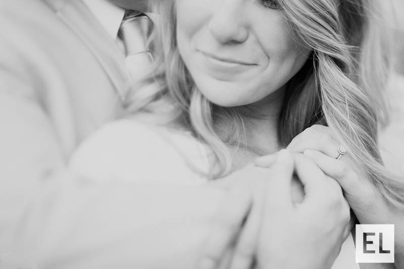
by Elsa Jensen | Oct 22, 2014 | Blog-category, People, Photos
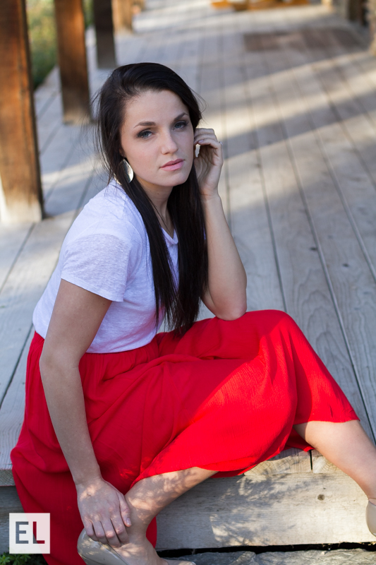
The best thing about taking portraits for people is that its usually during a time of their life that is exciting – and that’s true of graduates and senior pictures! Graduate photos is a growing market in the photography industry and utilizing all different types of lighting and poses for graduate portrait photography is an important key skill that I’ve learned. Having a sharp focus and a focus that draws the right attention to the subject is always essential, so a shallow depth of field with a fast shutter speed is important. I’ve been experimenting with using a f/2.8 to create a shallow depth of field and it’s been really fun to see how they turn out. Graduates and seniors are one of my favorite things to photograph because of the variety and energy – I hope you can tell! ...

by Elsa Jensen | Oct 22, 2014 | Blog-category, People, Photos
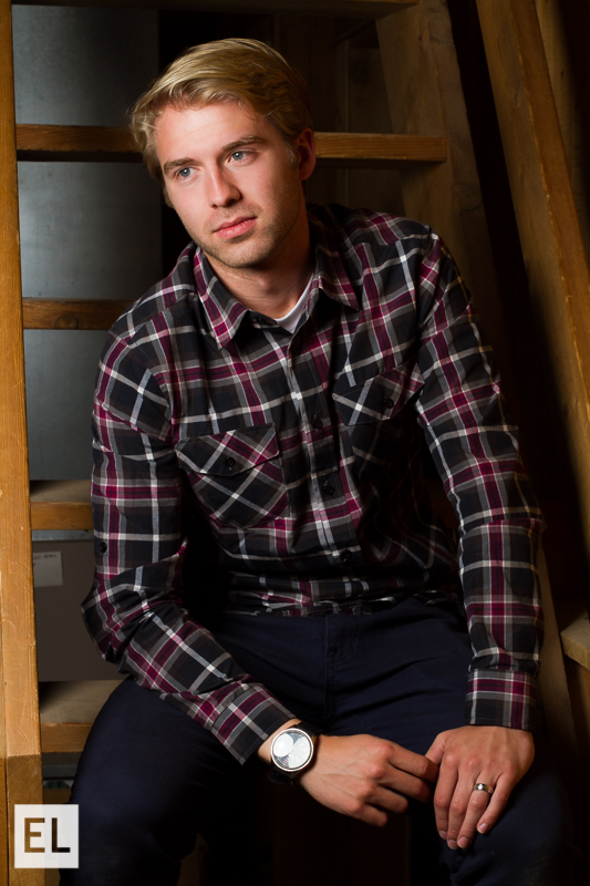
Using studio quality lighting can transform a portrait and take it to the next level! For most of my photography career and experience, I have been what I would call a ‘natural light snob’, only accepting photos and clients that were natural light. While we were in the Sky Mountain Lodge, we got the chance to try some high quality professional studio lighting that were provided to us and it definitely changed my opinion of portraits that are taken with studio lighting. These lights give the ability to creating lighting patterns that you want, give a soft light, and brighten any area that you use. With a higher aperture, fast shutter speed, and low ISO, it can create a perfect mix for a beautiful studio lighting...

by Elsa Jensen | Oct 20, 2014 | Blog-category, Places, Portfolio
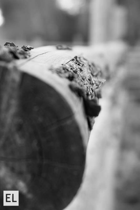
Fine Art Photo Op Stop – or FAPOS, as it is so commonly abbreviated in this class. On our excursion in Victor, Idaho we had plenty of opportunities to stop for fabulous photos of fine art. I also had the opportunity to spend a morning traveling to Moody Creek, Idaho with Whitney Majors to capture more fine art photos. I usually prefer to shoot portraits and still life photos because I have the ability to manipulate the subjects of the photos that I am taking. When I set out to take landscape photos, I always feel like I have a harder time being creative and capturing exactly what I see before me. This experience helped me to push myself creatively and learn how to capture landscapes as beautifully as I saw them. I gained a greater appreciation for bracketing photos so that I could gain a greater range of color and exposure that I can see before me. I also learned about the patience it takes to set up and execute a great landscape – it isn’t as easy as it looks! I also learned a lot more about using the right settings – like a small F/22 to get a great sun burst and sun flare of the sunrise or a bit of a slower shutter speed to capture the color of a slow colorful sunrise. I think that the more we push ourselves as creatives and photographers, the more that we learn to appreciate all forms and areas of photography and better master the other crafts that we usually pursue. ...

by Elsa Jensen | Oct 18, 2014 | Blog-category, Designs
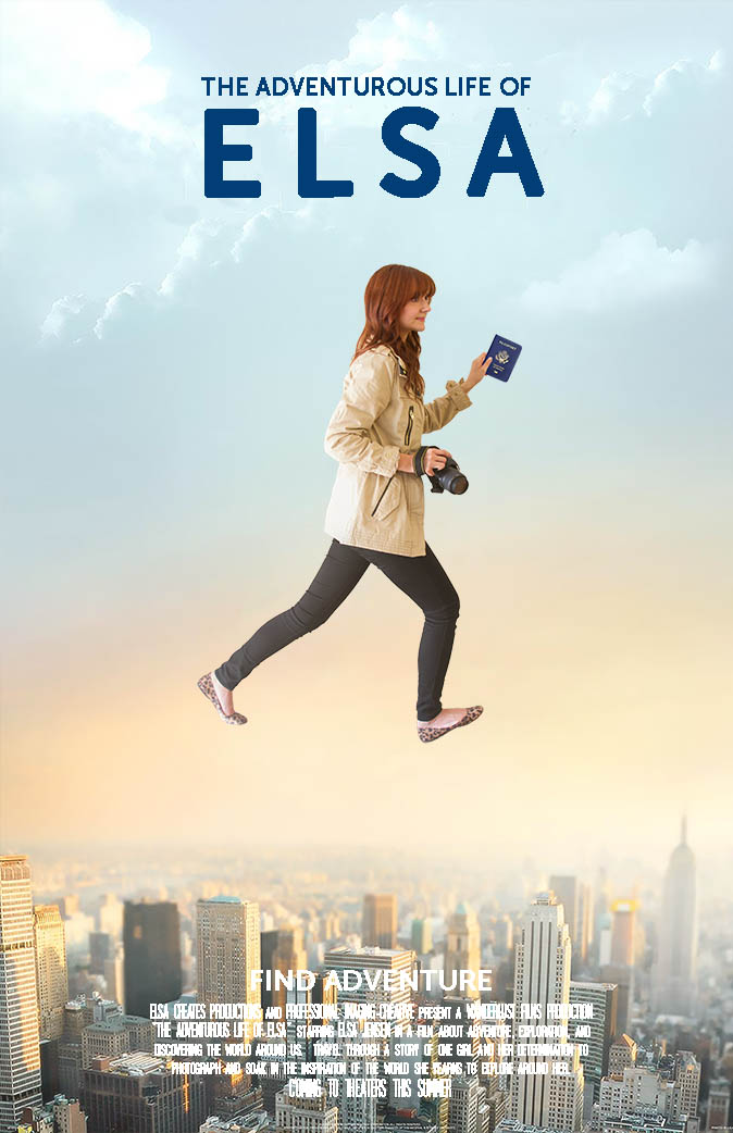
If there is any movie that could sum up everything about me and what I love in life, it is The Secret Life of Walter Mitty. I love to travel, explore, and I especially love to shoot photos and videos while I travel so I can capture the things that I see and explore. For class we had to create a movie poster, so of course, I decided to make myself a Secret Life of Mitty poster of Elsa. For the poster, I took a background image of the city and then took a picture of myself in the right pose (which looks silly, but was much harder that it looks!). I then made a selection and cutout of myself and laid it on top of the background image and did a little bit of blending with a layer mask for the rough edges and a warm gradient overlay at a very low opacity to make the image of me not stick out as much. I also learned a trick from a friend that by lowering the opacity of the top image of me to just 90% that it would appear to stick out less and be more a part of the poster, so I did that as well. Finally, I added the text at the top with a font that I thought bold and simple and then I added a summary at the bottom with a cinema font that is used in most movie posters. The finished product was great! ...

by Elsa Jensen | Oct 2, 2014 | Blog-category
Starting something new is always exciting, especially when its a new website, and I am very excited to present this website to you! My name is Elsa and I am a red headed girl that loves all things creative – design, videography, and especially photography. I learned from a young age that I love doing anything creative and I was blessed enough to be led to a program in a school that seems like it was made for me. This is a website geared towards and full of everything I learn while I’m here and will continue on with my business endeavors and personal projects. It is also a place to share ideas, creativity, and inspiration, because it is my firmest belief that we creatives need each other – so let’s share the love, yeah? Welcome, to Elsa Creates. ...
