by Elsa Jensen | Oct 29, 2014 | Blog-category, Designs, People, Photos, Portfolio
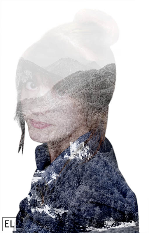
A few months ago I found a photographer that had a really fabulous eye and design for double exposure photography – Andre De Freitas. I’ve been looking around since then and noticing more and more double exposures that are done in Photoshop and I’ve wanted to take a try at making them myself, so I was excited for this assignment so I could try a double exposure. To create a double exposure, I used two images masked together with a few different techniques. I wanted to create a type of cutout, so first I made a selection of my first image (a self portrait) and refined the edges and made it as crisp and clean as possible. Then, with that selection, I laid the second image on top and made a mask of that image with the selection. That makes the image simply a silhouette, so to add my face and details back in, I copied the selection and added it to a new layer on top and changed the layering mode to screen. Then with layer masks, I was able to change up what I wanted different areas to look like and add or subtract to them. I also added a black and white layer at a very low opacity to wash out the color a little bit to emphasize the image. The finished product made me very happy – and it definitely made me want to keep trying more double exposure photos! ...

by Elsa Jensen | Oct 28, 2014 | Blog-category, Designs, People, Portfolio
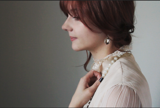
Have you ever seen Harry Potter? Do you know those moving portraits and paintings that line the hallways and staircases of Hogwarts – those have always fascinated me. Maybe it’s because I have a love for all things British or because Harry Potter is the best thing to happen to movies in literature in a long time, but when I heard that we were going to be doing a cinemagraph (which is essentially a Harry Potter moving picture), I was VERY excited. And in my usual fashion, I decided that I must do my cinemagraph in typical British fashion. So here is my Downton Abbey inspired cinemagraph. The gist of how to make a cinemagraph is actually quite easy – take a video of a continuous or looping motion and in Photoshop, mask out the areas of the video that you don’t want to move. It takes some precision and exactness when it comes to masking out the area, but it is so rewarding when its done! I love the simplicity of the motion, so I decided to have just a small simple earring moving to draw attention in a subtle way – you almost don’t notice it right away, and that’s what I love about a cinemagraph! (click on the picture to open for animation) To see another Downton Abbey inspired cinemagraph, check out my talented friend Erica White’s version here! And of course, what would a British inspired creative project be without another of my favorite British films, Harry Potter? Daily Prophet inspired, of course! (click on the picture for animation)...

by Elsa Jensen | Oct 26, 2014 | Blog-category, People, Photos, Weddings
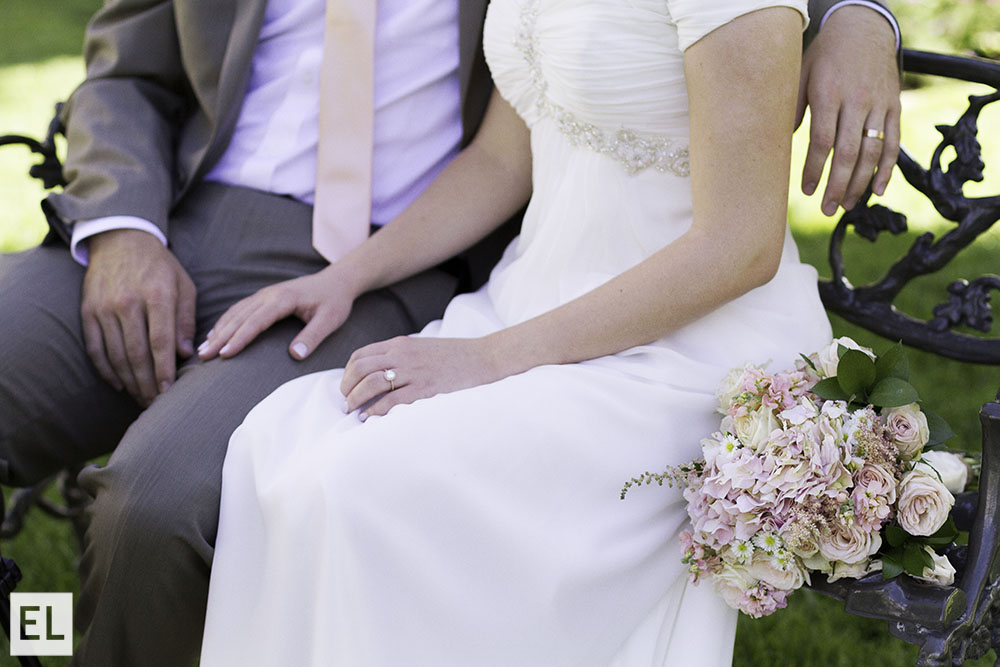
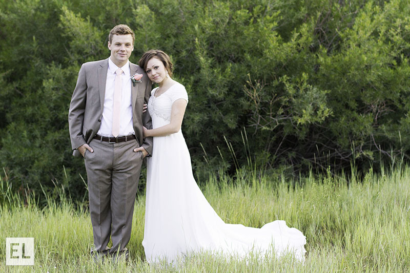
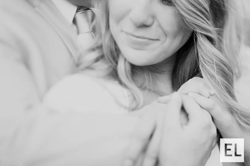
If there is one thing that I think I love photographing the most, its weddings. It’s a day full of hustle and bustle and pure happiness that makes my job so much more exhilarating and fun! As I’ve been emerging into the wedding photography business, I’ve had more fun getting to spend time with my clients on their special day, and I think I’ve got to be honest when I say that the Covington’s were my absolute favorite! These two were so full of love and fun, it wasn’t hard to waste away the day shooting their new marriage. It was a beautiful day at the Salt Lake Temple for any wedding, but this one had to have been the best – thanks for letting me share your day with you Katie and...

by Elsa Jensen | Oct 26, 2014 | Blog-category, People, Photos, Weddings
These bridals were absolutely wonderful! Tibble Fork Canyon was absolutely beautiful this time of year and the lighting and green trees made for the most serene feel. Being with Katie and Ashton a week before their wedding was an exciting feel and it definitely made for some wonderful pictures! Isn’t Utah just the best place for...

by Elsa Jensen | Oct 22, 2014 | Blog-category, People, Photos
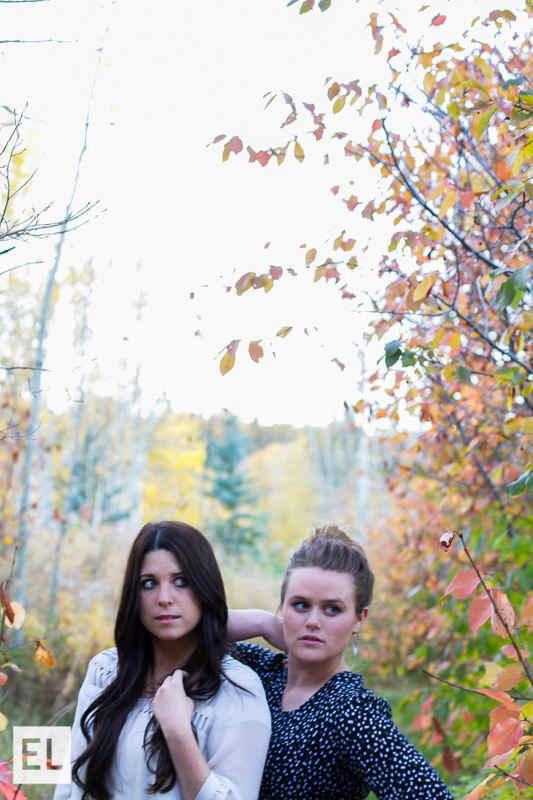
Group portraits always have a fun feel to them, whether its family pictures, school dance pictures, or just friends posing together. I always have a fun time shooting groups and pairs, and when we were at the Sky Mountain Lodge, it was even more fun to capture my fellow photographers and...

by Elsa Jensen | Oct 22, 2014 | Blog-category, People, Photos
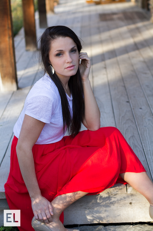
The best thing about taking portraits for people is that its usually during a time of their life that is exciting – and that’s true of graduates and senior pictures! Graduate photos is a growing market in the photography industry and utilizing all different types of lighting and poses for graduate portrait photography is an important key skill that I’ve learned. Having a sharp focus and a focus that draws the right attention to the subject is always essential, so a shallow depth of field with a fast shutter speed is important. I’ve been experimenting with using a f/2.8 to create a shallow depth of field and it’s been really fun to see how they turn out. Graduates and seniors are one of my favorite things to photograph because of the variety and energy – I hope you can tell! ...

by Elsa Jensen | Oct 22, 2014 | Blog-category, People, Photos
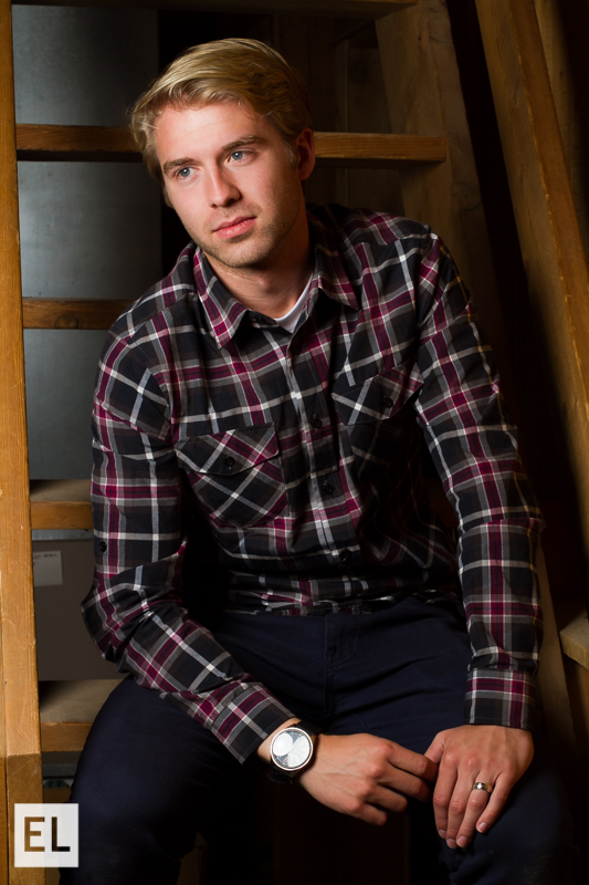
Using studio quality lighting can transform a portrait and take it to the next level! For most of my photography career and experience, I have been what I would call a ‘natural light snob’, only accepting photos and clients that were natural light. While we were in the Sky Mountain Lodge, we got the chance to try some high quality professional studio lighting that were provided to us and it definitely changed my opinion of portraits that are taken with studio lighting. These lights give the ability to creating lighting patterns that you want, give a soft light, and brighten any area that you use. With a higher aperture, fast shutter speed, and low ISO, it can create a perfect mix for a beautiful studio lighting...

by Elsa Jensen | Oct 20, 2014 | Blog-category, Places, Portfolio
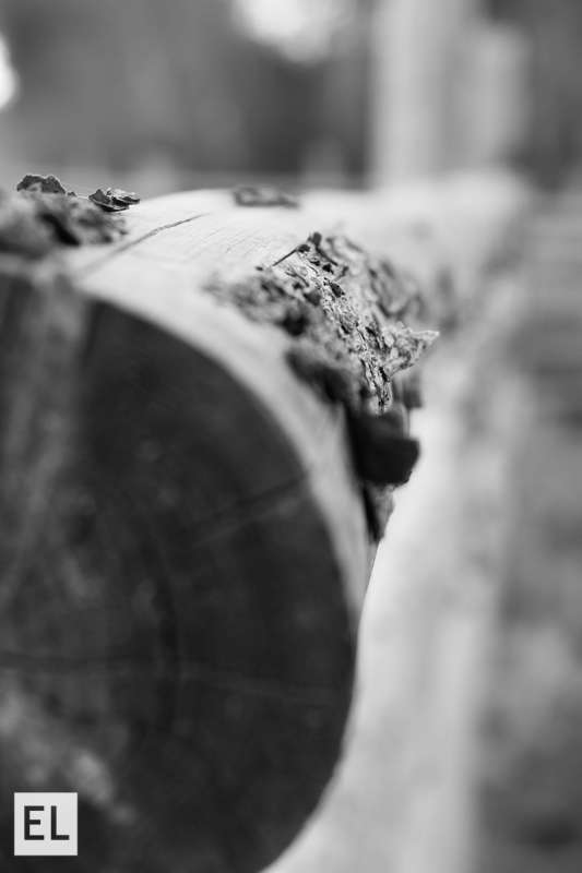
Fine Art Photo Op Stop – or FAPOS, as it is so commonly abbreviated in this class. On our excursion in Victor, Idaho we had plenty of opportunities to stop for fabulous photos of fine art. I also had the opportunity to spend a morning traveling to Moody Creek, Idaho with Whitney Majors to capture more fine art photos. I usually prefer to shoot portraits and still life photos because I have the ability to manipulate the subjects of the photos that I am taking. When I set out to take landscape photos, I always feel like I have a harder time being creative and capturing exactly what I see before me. This experience helped me to push myself creatively and learn how to capture landscapes as beautifully as I saw them. I gained a greater appreciation for bracketing photos so that I could gain a greater range of color and exposure that I can see before me. I also learned about the patience it takes to set up and execute a great landscape – it isn’t as easy as it looks! I also learned a lot more about using the right settings – like a small F/22 to get a great sun burst and sun flare of the sunrise or a bit of a slower shutter speed to capture the color of a slow colorful sunrise. I think that the more we push ourselves as creatives and photographers, the more that we learn to appreciate all forms and areas of photography and better master the other crafts that we usually pursue. ...

by Elsa Jensen | Oct 18, 2014 | Blog-category, Designs
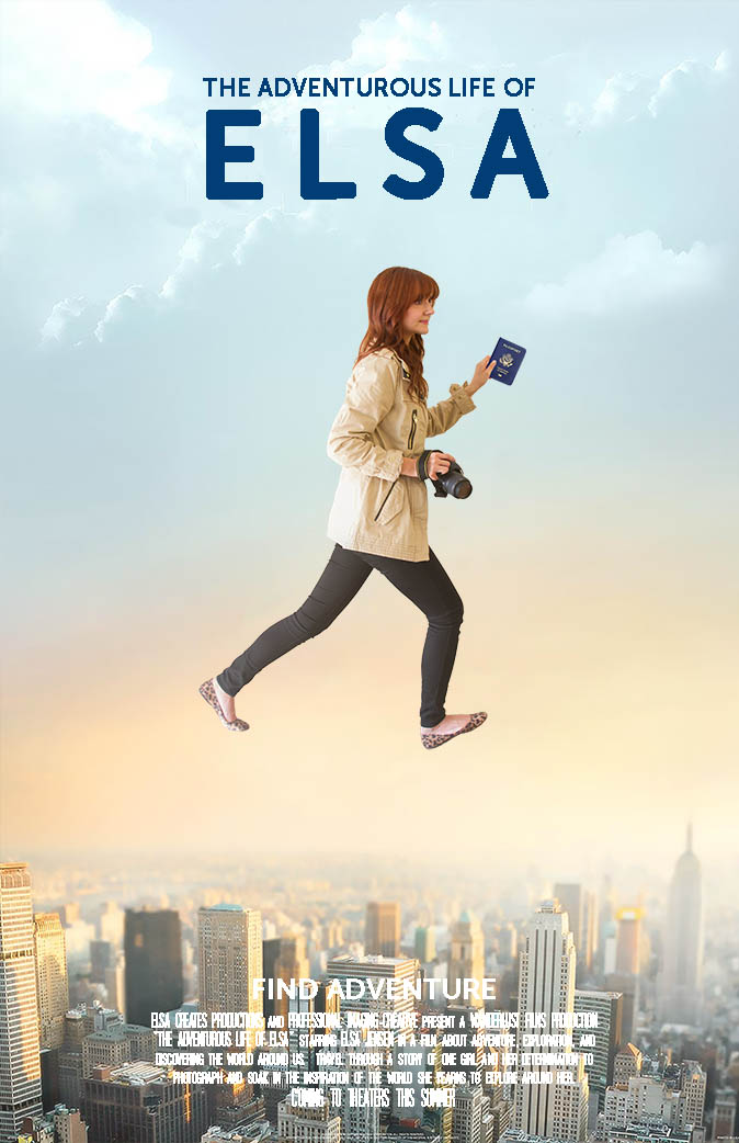
If there is any movie that could sum up everything about me and what I love in life, it is The Secret Life of Walter Mitty. I love to travel, explore, and I especially love to shoot photos and videos while I travel so I can capture the things that I see and explore. For class we had to create a movie poster, so of course, I decided to make myself a Secret Life of Mitty poster of Elsa. For the poster, I took a background image of the city and then took a picture of myself in the right pose (which looks silly, but was much harder that it looks!). I then made a selection and cutout of myself and laid it on top of the background image and did a little bit of blending with a layer mask for the rough edges and a warm gradient overlay at a very low opacity to make the image of me not stick out as much. I also learned a trick from a friend that by lowering the opacity of the top image of me to just 90% that it would appear to stick out less and be more a part of the poster, so I did that as well. Finally, I added the text at the top with a font that I thought bold and simple and then I added a summary at the bottom with a cinema font that is used in most movie posters. The finished product was great! ...

by Elsa | Oct 16, 2014 | Blog-category, Things
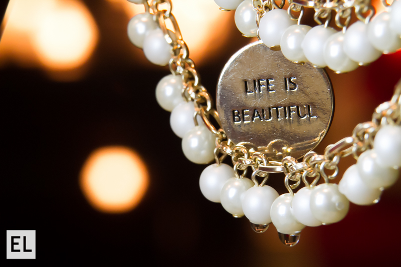
If there is one thing I can say about water drops and macro photography, its all about patience. It was quite an experience to learn and figure out what ways to make water drops work and on what surfaces they stay well on. It is a process of trial and error, but once we started to figure out exactly how to do it, getting those water drops with a reflection can be just like magic. It was also really fun to see when a reflection would pull through the water drop and create a scene worth seeing. For the set up, I used both the 31mm and 13mm extension tubes to get in nice and tight. I also used a LED light to make sure that the scene was lit well enough, because I needed a very fast shutter speed (1/250) and tight aperture (F/14) to catch the water drop before it fell. It was fun to work with different things for reflections and I think it is definitely a photography skill worth having!...

by Elsa Jensen | Oct 2, 2014 | Blog-category
Starting something new is always exciting, especially when its a new website, and I am very excited to present this website to you! My name is Elsa and I am a red headed girl that loves all things creative – design, videography, and especially photography. I learned from a young age that I love doing anything creative and I was blessed enough to be led to a program in a school that seems like it was made for me. This is a website geared towards and full of everything I learn while I’m here and will continue on with my business endeavors and personal projects. It is also a place to share ideas, creativity, and inspiration, because it is my firmest belief that we creatives need each other – so let’s share the love, yeah? Welcome, to Elsa Creates. ...

by Elsa | Oct 2, 2014 | Blog-category, Designs
My new redesign and rebranding for my company took me back to what I love the most in design and photography and that is simplicity. So to reflect my style, my photos, and my philosophies, I created a business card and a new logo that would reflect just that – simple, clean, and beautiful design. When using me as your photographer, you can expect a process and product that are simple and reflect the beautiful aspects...

by Elsa | Sep 26, 2014 | Blog-category, Photos, Places
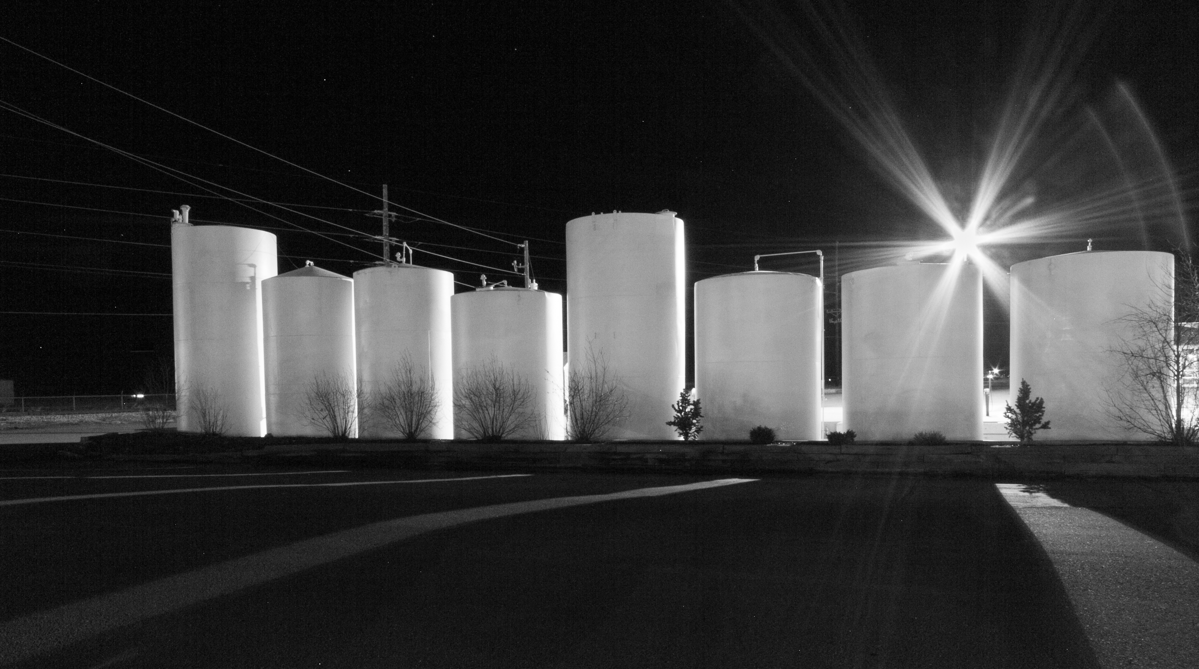
I was really excited about the things that I could do with this assignment. While it sounds simple enough, the task was pretty fun and got me to try new things with photography that I never have before. Take an ordinary spot and take an extraordinary shot, showing the place in new light and with new vision. I was inspired by classmates and decided to use this assignment to try and practice my abilities with night photography. I’ve noticed the beauty and change that night can bring to a scene lately and I thought it would be a fun and interesting way to not only take an aspect of a place that is extraordinary, but to also show it in a different setting. And here is the finished...

by Elsa | Sep 26, 2014 | Blog-category, People, Photos
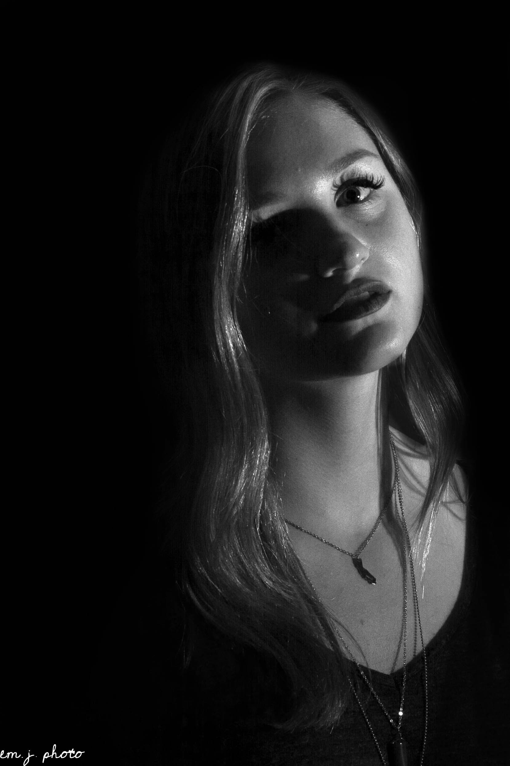
When I first heard the abbreviation SQIBB, I thought we were talking about the Harry Potter term for a non-magical person trying to learn magic on their own, but that’s definitely not the case! A SQIBB portrait is an incredible way of creating a Studio Quality Invisible Black Background in any lighting, any setting, with just your camera, a speedlight flash, and a flash bender. So I set up my models in my living room during the height of the sun and bright light and set up my flash with the rogue flash bender – I made sure to partially ‘snoot’ the flash bender to direct the light and I also used the diffuser to diffuse the flash just a little bit. I then tested my settings and flash until I found a good exposure with a f/9, 250th exposure, and an 1/8 on my flash. I was trying to accomplish a dramatic, but also soft light to accentuate the different styles of dramatic lighting....
