by Elsa Jensen | Mar 18, 2015 | Blog-category, Designs
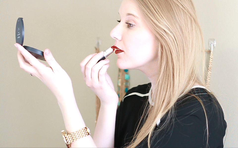
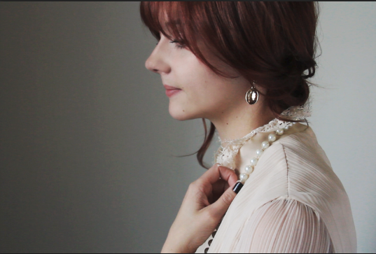
I don’t think I will ever get sick of cinemagraphs. They are so captivating and tell a story in a different way that leaves me wanting to make and see more and more cinemagraphs. So naturally, I had to make one again. While I’ve spent time looking at other cinemagraphs, especially the beautiful ones from the most talented and professional Jamie Beck and Kevin Burg from Ann Street Studio, who began the sensation of cinemagraphs are the experts, if I do say so myself (really though, I could watch their cinemagraphs for hours), I’ve noticed that the key to a truly captivating cinemagraph is the selective movement. Their fashion and beauty cinemagraphs have always inspired me and I decided to give a try at one. I wanted to make a selective portion of movement, so I decided to only show the movement of her hand putting the lipstick on. Making cinemagraphs always teaches me new things and I want to continue to make more in the future and refine my skills in...
by Elsa Jensen | Mar 15, 2015 | Blog-category, Designs, Photos, Videos
As part of the Communications program at BYU-Idaho, one of our final classes is a senior project. For this class, we pick a project that will showcase everything we have learned while in the communications department and spend 50 hours throughout the semester working on this project and present it to the school at the end during the Senior Showcase. With an emphasis in Visual Communications, I wanted to come up with a project that would showcase all of the things that I have learned and loved while in that department. I’ve shared the story time and again about my family and our pizza tradition. My brothers and I have talked to my dad about starting a pizza delivery business once or twice a week to earn a little extra money and have more fun making pizza. My dad has bugged me time and again about making him a logo or coming up with pizza box ideas for our pizza, but while I’ve always been too busy, I decided that for my senior project, I would finally get to work on this pizza design. I decided that I would start up and create all of the visual and creative aspects that a pizza business would need to begin. With my module set in advertising, it was very helpful for me when I was deciding what it was that I needed to have done for this business and process. I began by branding the company with color schemes, font choices, overall looks, and a logo to be used throughout the branding. I then worked on designing the collateral needs like...

by Elsa Jensen | Mar 14, 2015 | Blog-category, Designs
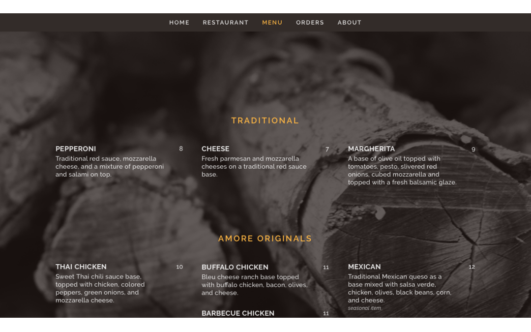
The most intriguing, yet time consuming and difficult aspect of my senior project and I think of most branding and creative projects for a business is building a website. Setting out the priorities of the site, what needs to be added (or not added), creating content, and having it all flow together with a nicely designed visual aspect is part of the entirety that makes for a successful website (no matter how much work it might be). Pizzeria Amore’s website is set up as a one page website – all aspects of the website can be seen without leaving the main page, all you have to do is simply scroll. You can also visit each page by clicking on the link on the menu, but it still stays within the same main interface page. Setting up a restaurant website this way is a good option because of it the access it gives to visitors – in all honesty, most people that visit a restaurant website only visit to see the menu, location, hours, or order form. With this option, most likely, the content surrounding those pages will be visited or more likely to be visited because of the ease and set up of the site. I decided to go with photo backgrounds to incorporate the photography and give the family feel. I kept the color scheme and fonts simple again to reflect the design previously done. Want to take a deeper look at it – well I think you should take a better look at it truly! Follow this link over to the website and see it for yourself!...

by Elsa Jensen | Mar 13, 2015 | Blog-category, Designs
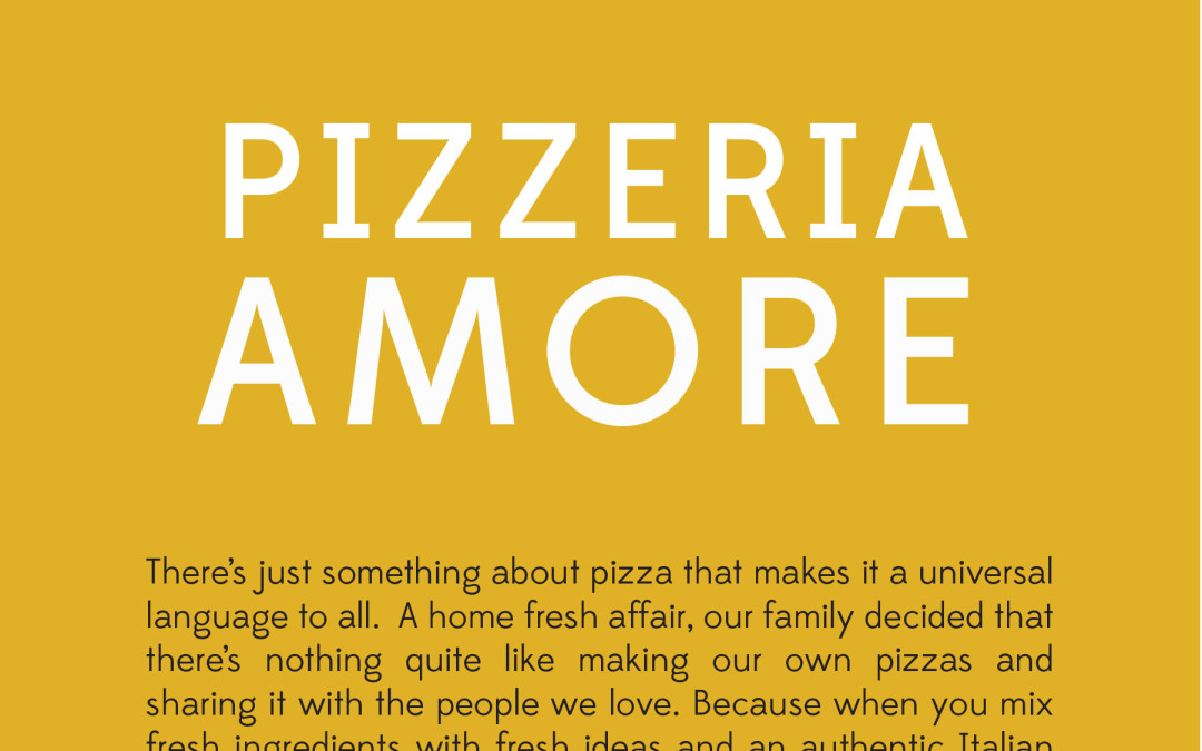
As a small family run restaurant just beginning, there were only a couple of basic design needs, but it was important to make sure they were done with the Pizzeria Amore brand. The basics needs included a menu design and a business card. To stay with the branding and design and showcase a family feel of wood fired fresh pizza, I used the photography from the series with a black and white high contrast look set behind all of the copy and content. To keep the simplicity, I used the same font throughout and simple shapes to add a bit. I also wrote the copy for the front of the menu to share a look into the restaurant before taking a look at the...

by Elsa Jensen | Mar 13, 2015 | Blog-category, Designs, Home Page
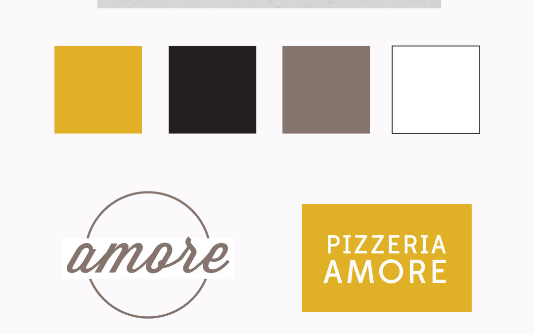
The most important part of branding that I have learned is direction. I first began working on a logo and branding for Pizzeria Amore just simply by designing things that I thought looked good but I soon realized that it was difficult to keep working through the rest of my project without a sense of direction and main major element. Once I sat down and established the message that I was trying to convey with the business and the target audience and what they would be interested in, it gave me a major sense of direction and purpose that helped to drive me throughout everything I created from the photography to the video to the website. As a part of that, I decided to share my design and branding inspiration and process at the senior showcase at BYU-Idaho. I think its very helpful to see the process laid out and the basic guidelines for the brand that need to be followed through with the elements. Here’s a small look at that – it’s what I like to call a simplified visual style...

by Elsa Jensen | Mar 3, 2015 | Blog-category, Designs
As a communication student at BYU-Idaho, we have the unique experience of having one of classes in our final senior semesters that lets us showcase our talents and education gained during our years there. For my senior project, I am creating all of the creative branding and collateral for my family’s small pizza delivery business, Pizzeria Amore. I am using this project to show all of the things that I have learned and developed while I was in the Visual Communications department, like photography, videography, web design, and of course graphic design. As I’ve been working on this project, I’ve learned that the most important part of a branding and design is the actual logo and design direction – I had a really great time drawing inspiration and putting together different logos and color schemes. It was really difficult to choose just one logo, but you’ll have to stay tuned for more branding and pieces of my...

by Elsa Jensen | Feb 2, 2015 | Blog-category, Designs, Home Page
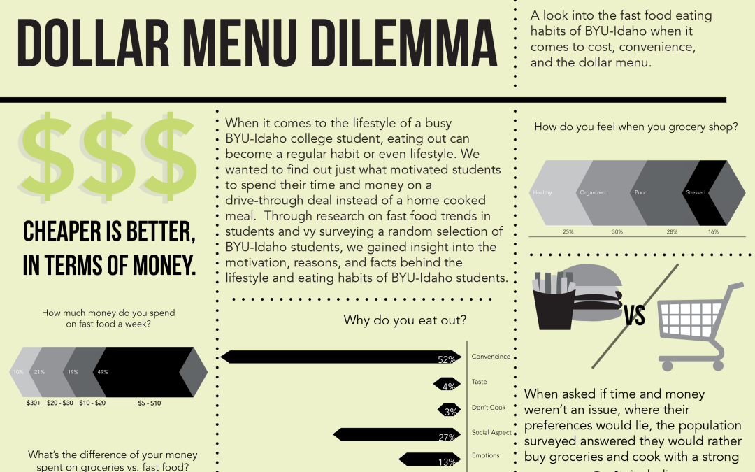
This last semester at school I took a research fundamentals class in which I worked with a group on a research project gathering data, making sense of it, and then presenting it. My group decided to find out more about college students and fast food – we wanted to know more behind it, like why college students eat, how much they spend, and other things. We learned some very interesting things about the fast food epidemic on BYU-Idaho’s campus and I made an infographic for our final presentation to show the results simply. I love infographics – they show a lot of information in a concise and more visually appealing way and making them is even more fun than reading them. This one was even more fun because I was a part of finding the...

by Elsa Jensen | Nov 14, 2014 | Blog-category, Designs, People, Photos
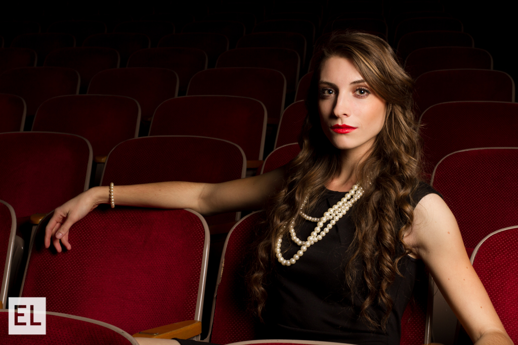
As a creative and a person, I have always been fascinated and drawn to movies and media from the classic era. Audrey Hepburn, Fred Astaire, Vivienne Leigh, Cary Grant – they all inspire me! So of course when it came time to come up with a conceptual fashion portrait, I wanted to do something that had that same feel and idea. I had my wonderful and beautiful childhood friend Brooke come to model for me – her face reminds me of Katherine Hepburn! I chose red theater seats and had her dress in a classy Breakfast at Tiffany’s feel because I wanted to create a theater scene and feel. I had a lot of fun with her and using the Einstein light to create the right feel. I especially loved the way her red lips popped with the red theater seats. This was so fun to do!...

by Elsa Jensen | Oct 29, 2014 | Blog-category, Designs, People, Photos, Portfolio
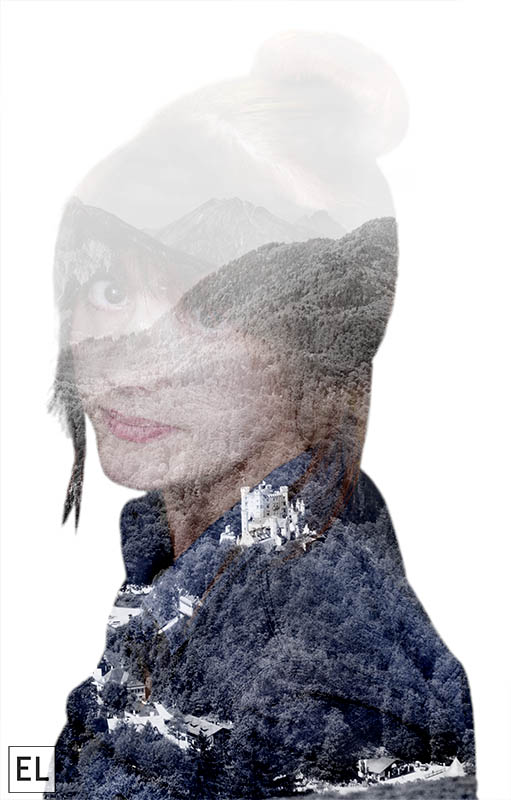
A few months ago I found a photographer that had a really fabulous eye and design for double exposure photography – Andre De Freitas. I’ve been looking around since then and noticing more and more double exposures that are done in Photoshop and I’ve wanted to take a try at making them myself, so I was excited for this assignment so I could try a double exposure. To create a double exposure, I used two images masked together with a few different techniques. I wanted to create a type of cutout, so first I made a selection of my first image (a self portrait) and refined the edges and made it as crisp and clean as possible. Then, with that selection, I laid the second image on top and made a mask of that image with the selection. That makes the image simply a silhouette, so to add my face and details back in, I copied the selection and added it to a new layer on top and changed the layering mode to screen. Then with layer masks, I was able to change up what I wanted different areas to look like and add or subtract to them. I also added a black and white layer at a very low opacity to wash out the color a little bit to emphasize the image. The finished product made me very happy – and it definitely made me want to keep trying more double exposure photos! ...

by Elsa Jensen | Oct 28, 2014 | Blog-category, Designs, People, Portfolio
Have you ever seen Harry Potter? Do you know those moving portraits and paintings that line the hallways and staircases of Hogwarts – those have always fascinated me. Maybe it’s because I have a love for all things British or because Harry Potter is the best thing to happen to movies in literature in a long time, but when I heard that we were going to be doing a cinemagraph (which is essentially a Harry Potter moving picture), I was VERY excited. And in my usual fashion, I decided that I must do my cinemagraph in typical British fashion. So here is my Downton Abbey inspired cinemagraph. The gist of how to make a cinemagraph is actually quite easy – take a video of a continuous or looping motion and in Photoshop, mask out the areas of the video that you don’t want to move. It takes some precision and exactness when it comes to masking out the area, but it is so rewarding when its done! I love the simplicity of the motion, so I decided to have just a small simple earring moving to draw attention in a subtle way – you almost don’t notice it right away, and that’s what I love about a cinemagraph! (click on the picture to open for animation) To see another Downton Abbey inspired cinemagraph, check out my talented friend Erica White’s version here! And of course, what would a British inspired creative project be without another of my favorite British films, Harry Potter? Daily Prophet inspired, of course! (click on the picture for animation)...

by Elsa Jensen | Oct 18, 2014 | Blog-category, Designs
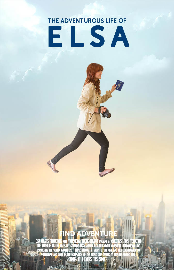
If there is any movie that could sum up everything about me and what I love in life, it is The Secret Life of Walter Mitty. I love to travel, explore, and I especially love to shoot photos and videos while I travel so I can capture the things that I see and explore. For class we had to create a movie poster, so of course, I decided to make myself a Secret Life of Mitty poster of Elsa. For the poster, I took a background image of the city and then took a picture of myself in the right pose (which looks silly, but was much harder that it looks!). I then made a selection and cutout of myself and laid it on top of the background image and did a little bit of blending with a layer mask for the rough edges and a warm gradient overlay at a very low opacity to make the image of me not stick out as much. I also learned a trick from a friend that by lowering the opacity of the top image of me to just 90% that it would appear to stick out less and be more a part of the poster, so I did that as well. Finally, I added the text at the top with a font that I thought bold and simple and then I added a summary at the bottom with a cinema font that is used in most movie posters. The finished product was great! ...

by Elsa | Oct 2, 2014 | Blog-category, Designs
My new redesign and rebranding for my company took me back to what I love the most in design and photography and that is simplicity. So to reflect my style, my photos, and my philosophies, I created a business card and a new logo that would reflect just that – simple, clean, and beautiful design. When using me as your photographer, you can expect a process and product that are simple and reflect the beautiful aspects...
