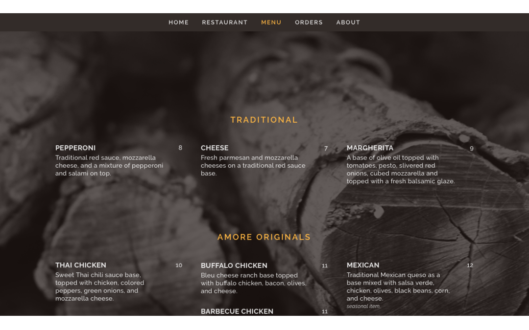
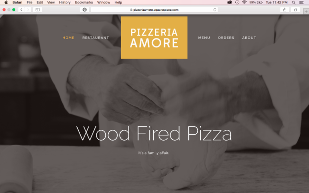
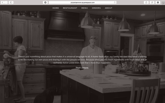
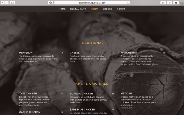
The most intriguing, yet time consuming and difficult aspect of my senior project and I think of most branding and creative projects for a business is building a website. Setting out the priorities of the site, what needs to be added (or not added), creating content, and having it all flow together with a nicely designed visual aspect is part of the entirety that makes for a successful website (no matter how much work it might be). Pizzeria Amore’s website is set up as a one page website – all aspects of the website can be seen without leaving the main page, all you have to do is simply scroll. You can also visit each page by clicking on the link on the menu, but it still stays within the same main interface page. Setting up a restaurant website this way is a good option because of it the access it gives to visitors – in all honesty, most people that visit a restaurant website only visit to see the menu, location, hours, or order form. With this option, most likely, the content surrounding those pages will be visited or more likely to be visited because of the ease and set up of the site. I decided to go with photo backgrounds to incorporate the photography and give the family feel. I kept the color scheme and fonts simple again to reflect the design previously done. Want to take a deeper look at it – well I think you should take a better look at it truly! Follow this link over to the website and see it for yourself!


